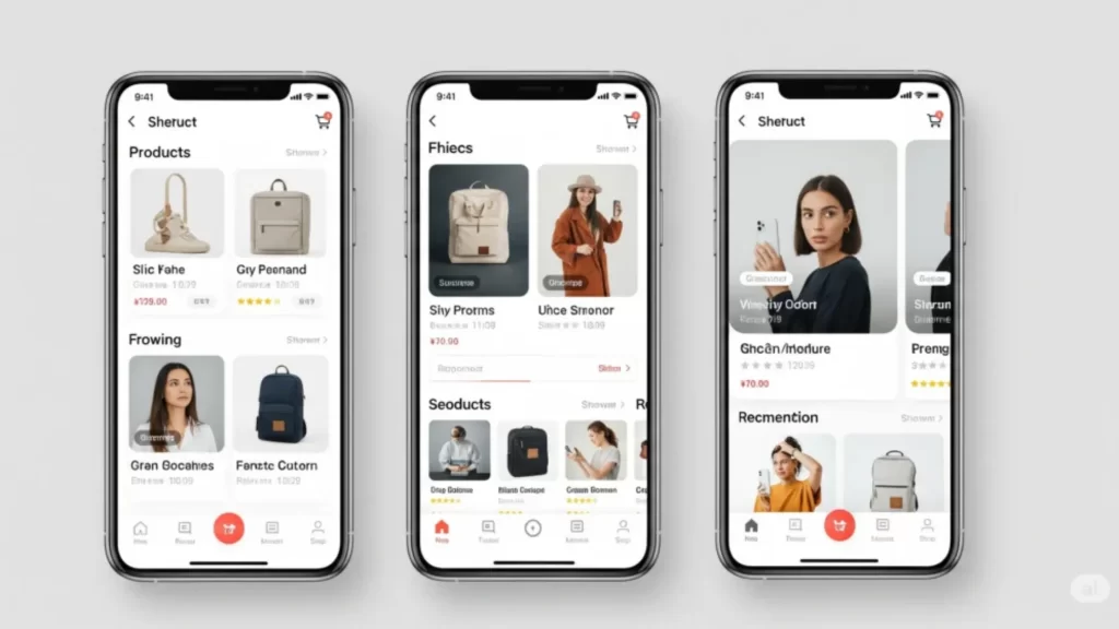
Boosting Mobile Sales: A “Thumb-Friendly” UX Strategy
Client: A D2C (Direct-to-Consumer) fashion brand on Shopify.

Challenges We Faced
The client’s Shopify site was “technically” responsive, but the mobile user experience (UX) was terrible:
Low Mobile Conversion
Mobile users converted at 0.5% compared to 2.5% on desktop.
Tiny Buttons
The “Add to Cart” and “Filter” buttons were too small to tap easily (Touch-Friendly Navigation failure).
Poor Font & Image Scaling
Product images were too small on mobile, and users couldn’t see the details.

Slow Mobile Speed
Large, desktop-sized images were being loaded on mobile, killing load times.
High Mobile Cart Abandonment
GA4 data showed over 80% of mobile users were leaving mid-checkout due to frustration with navigation, slow load times, and usability issues.

Boost Mobile Conversions
“Is your mobile checkout frustrating users? Our UI/UX Analysis (Responsive) will find the friction points and fix them.”
Our Approach – How We Solved These Challenges
Results
| Metric | Before | After | Growth |
|---|---|---|---|
| Mobile Conversion Rate | 0.5% | 1.8% | +260% |
| Mobile “Add to Cart” Rate | 3.5% | 8.2% | +134% |
| Mobile Page Speed Score | 35 | 88 | +151% |

Free Mobile UX Audit
“Not sure why mobile users aren’t buying? Book a Free UX Audit and let our responsive web design and seo team find the leaks!”
Advice for Marketers & Brand Owners
- Design for thumbs. Mobile users navigate with their thumbs. Make your buttons big and easy to reach.
- “Responsive” doesn’t mean “optimized.” Just because elements stack doesn’t mean they are usable.
- Optimize your images for mobile. Don’t serve a 2000px desktop image to a 300px mobile screen. Use responsive image serving.
Extra Factors That Made It Work
- The Microsoft Clarity insights were the key to identifying the “rage click” issues.
- Increasing the button size had an immediate, measurable impact on the “Add to Cart” rate.
- The faster load times (from optimized images) reduced bounce rates significantly.
